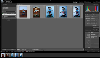
For our commercial products I have a few ideas which i am going to test out and choose the best. This product is one of my ideas "Pinocchio" which is one of the Disney Traditional Collectibles. The two images below is the character that I'm photographing but what i have done below i am not happy with.
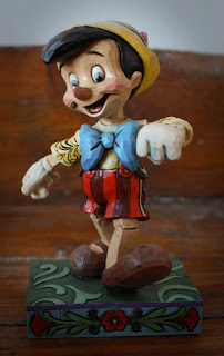
I like the way the character looks, but i tried to get a different background then just white but the wood behind looks dirty and it cuts of to white so the wood isn't continuous so Ive decided this is one of my practise shots.
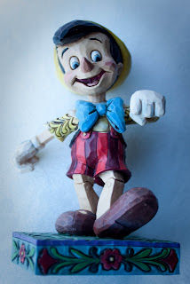
Again with this image i tried to use a white background but at the time I didn't have one so i led the figurine on a white pillow not realising that's it doesn't look correct as it looks like he is floating in mid air.
I feel that even though what Ive done I'm not to use towards my final product I feel that I've learnt that you have to be aware of everything you photography and how it will look within the shot.
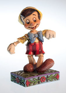
I attempted to take another picture of Pinocchio. I used the studio and used a white background and studio lighting. This Image is much better than the others above. It has a slight blue edge around the figurine but because it is at the centre of body your eyes go towards it and the colour blue goes well with the blues on Pinocchio. I posioned to him so he is facing the screen, this is so it shows more of him off.


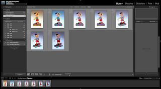 Importing Files/Folders
 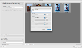 Naming Files/Folders


 Again with this image i tried to use a white background but at the time I didn't have one so i led the figurine on a white pillow not realising that's it doesn't look correct as it looks like he is floating in mid air.

 I was high up. So I was able to see the sun setting til the very end. This image shows you the different colour of light what the sun setting makes.
+047.jpg)