Wednesday, 6 October 2010
Tuesday, 12 January 2010
Competition
Monday, 11 January 2010
Digital Darkroom (2): Writing a Caption
Digital Darkroom (1): Importing and Organising
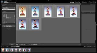 Importing Files/Folders
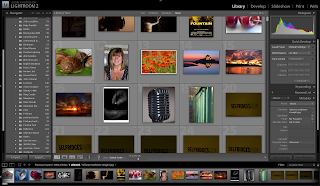
 As you can see in the screen capture to the left, i have imported some images. It shows you how it is importing.
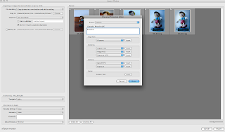 Naming Files/Folders
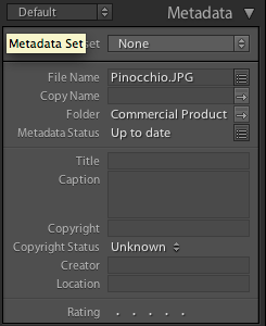
As seen in this screen shot to the left you can see that I am about to import my files but I have changed the file name so instead of the files being called JPEG's I've renamed them to Pinocchio.
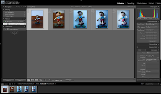
Organising Files/Folders
As you can see in the screen shot to the left my files are in alphabetical order. The are organised making it easier for me when editing to find the folder i need quicker and easier.

This is a closer few of my organised files and folders.
Sunday, 10 January 2010
Street Light

I chose to take an image of a car underneath a street light because the protection over the lights of the car is see through so it showed off the colour of the street light better.
I took two shots of the car with the street light but changed the setting on my camera to tungsten and flurscent. The tungsten setting was used in the image to the left. The light looks white and shows the individual colours off.
This means that the tungsten setting and the street light both light at the same degree kelvins which is about 3200 so they make the light neutral.

This shot was taking using the flurscent setting on my camera, as you can see the car and the background has a orange tint to it.
Thursday, 7 January 2010
Blog Sites
I have done some research on some other blogs, to find inspiration and ideas for my blog.
I had a look at this link below and I liked how the top bar has an image in it and straight away it made me wont to continue reading.
http://iron-mitten.blogspot.com/
I had a look at this link below and I liked how the top bar has an image in it and straight away it made me wont to continue reading.
http://iron-mitten.blogspot.com/
Wednesday, 6 January 2010
Commercial Product
For our commercial products I have a few ideas which i am going to test out and choose the best. This product is one of my ideas "Pinocchio" which is one of the Disney Traditional Collectibles. The two images below is the character that I'm photographing but what i have done below i am not happy with.
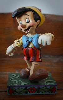
I like the way the character looks, but i tried to get a different background then just white but the wood behind looks dirty and it cuts of to white so the wood isn't continuous so Ive decided this is one of my practise shots.
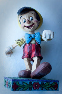 Again with this image i tried to use a white background but at the time I didn't have one so i led the figurine on a white pillow not realising that's it doesn't look correct as it looks like he is floating in mid air.
I feel that even though what Ive done I'm not to use towards my final product I feel that I've learnt that you have to be aware of everything you photography and how it will look within the shot.

I like the way the character looks, but i tried to get a different background then just white but the wood behind looks dirty and it cuts of to white so the wood isn't continuous so Ive decided this is one of my practise shots.
 Again with this image i tried to use a white background but at the time I didn't have one so i led the figurine on a white pillow not realising that's it doesn't look correct as it looks like he is floating in mid air.
I feel that even though what Ive done I'm not to use towards my final product I feel that I've learnt that you have to be aware of everything you photography and how it will look within the shot.
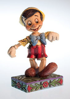
I attempted to take another picture of Pinocchio. I used the studio and used a white background and studio lighting. This Image is much better than the others above. It has a slight blue edge around the figurine but because it is at the centre of body your eyes go towards it and the colour blue goes well with the blues on Pinocchio. I posioned to him so he is facing the screen, this is so it shows more of him off.

Subscribe to:
Comments (Atom)


+047.jpg)